


A bookmarking tool
for expectant parents
SPRINT TEAM • UX/UI • PITCH TEAM
Aptamil is one of the top formula brands in the UK, its products are trusted because it’s backed by 50+ years of research. Aptimil challenged us to create a digital product that appeals to a new audience and delivers new value to their brand.
Business Requirement
Attract a newer audience through a modern digital experience.
Customer Demand
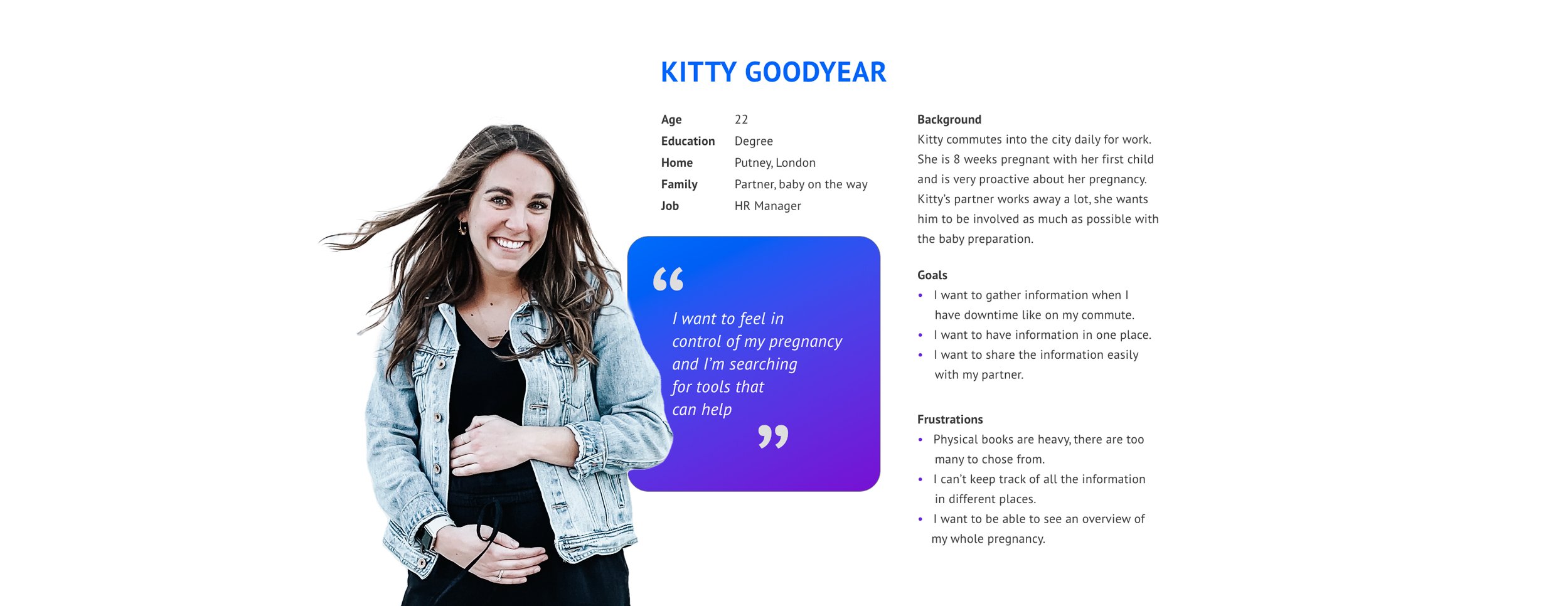
I want trustworthy information, properly organised, that puts me in charge of my own pregnancy.
Goals and objectives
Taking part in the sprint team, stand ups, client meetings and retrospectives.
Making my voice heard, and ensuring that creative strategy and UX had a voice throughout the project.
Creation of rapid wireframes and paper prototypes.
Working with UX researchers to validate and test designs through creation of interactive prototypes.
My role
Apitmil identified the target audience, which was the focus for this product - professional, organised, independent thinking women.
Audience and persona
Considerations
Indirect marketing: Aptimil can’t market directly to customers.
Brand limitations: Aptimil are unable to create an abundance of content.
Competition: Aptimil can’t compete with their main rival ‘The Baby Centre’.
We conducted a 5 day creative sprint, an intense and very enjoyable process, where we rapidly progressed from problem to tested solution.
Research
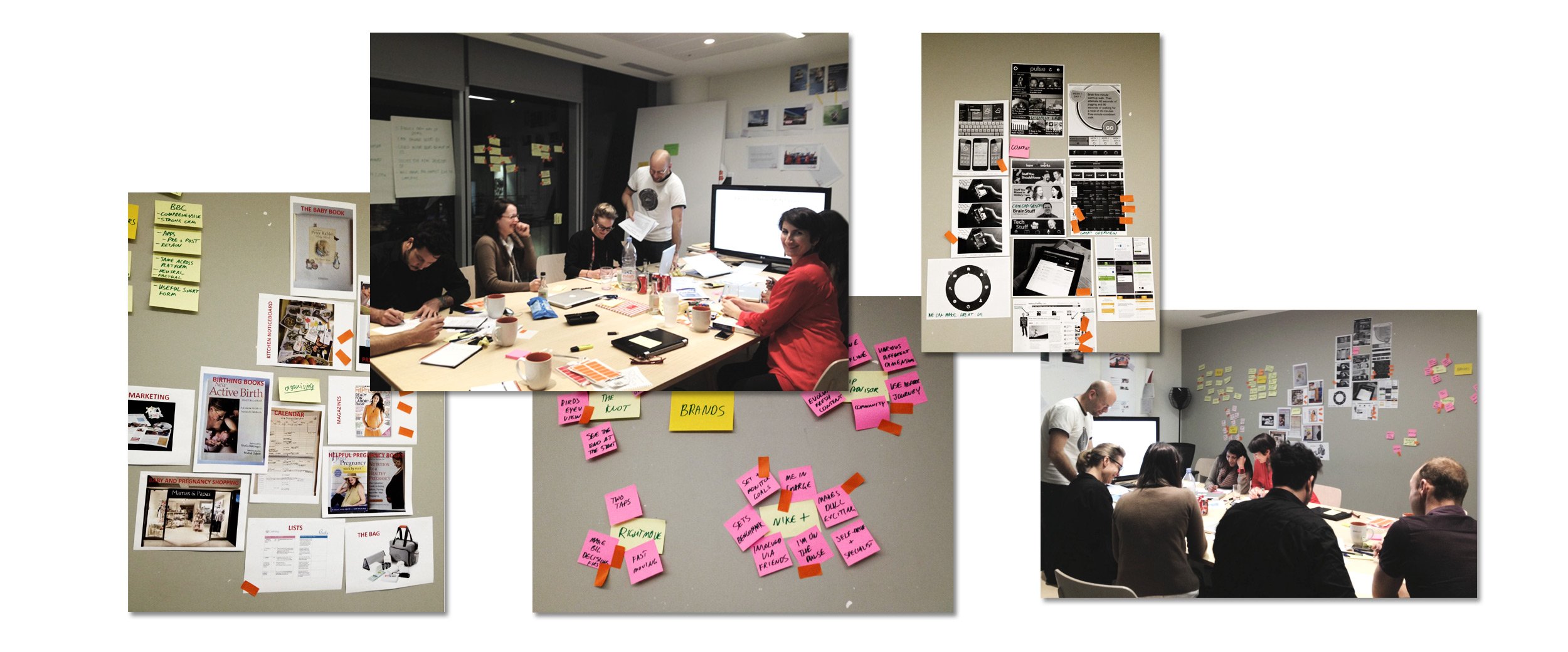

Concept
The online family
organiser
From nutrition advice to shopping tips, Project Baby helps you keep every stage of your pregnancy completely organised.
The concept is very much influenced by Mum’s use of the kitchen planner and organiser. We stay true to that core behaviour by referencing their offline behaviours, to create an online tactile experience.
A device specific experience, highlighting the different functions of each platform to maximise the potential of each device..
A single minded and solid UX provides an intuitive journey, aiding clarity and making Mum feel in control.
Clear and clean UI reflects the professional and trustworthy personality of the brand.
Life planning and information living together, organic and fluid, creating a personalised journey that can carry on after the baby is born.
Using colour to signpost makes it easier to navigate through the journey.
Involving Dad is a distinctive feature unique in this space.
Notifications help us to connect with Mum at relevant times and locations.
Details


Addressed accessibility needs in the initial design process and designed with this in mind.
Allow the product to adapt to the users personality, for example providing several dashboard colours schemes.